Originally researched and prepared as part of public presentations with the Racial Equity Institute
Sixty years after America declared a war on poverty, a little-appreciated measure helps explain why and where poverty persists in the country today
In January 1964, in his first State of the Union address, President Lyndon Johnson declared “unconditional war on poverty in America.” By the government’s own yardstick, much of it was won. The official poverty rate has fallen from about 19% in 1964 to a near record low of 10.6% in 2024. The safety net built in those years does even more than that headline number shows: Social Security alone now lifts more than 27 million Americans out of poverty every year, and poverty among people over 65 — close to 30% in the mid-1960s — has dropped to under 10%, a decline economists credit largely to that one program.
“Unfortunately, many Americans live on the outskirts of hope—some because of their poverty, and some because of their color, and all too many because of both. Our task is to help replace their despair with opportunity. This administration today, here and now, declares unconditional war on poverty in America. I urge this Congress and all Americans to join with me in that effort.”
— President Lyndon B. Johnson, January 8, 1964
And yet the war never quite ended. In absolute numbers, almost exactly as many Americans are poor today as when Johnson spoke: 36.1 million in 1964, and 35.9 million in 2024. The rate fell chiefly because the country added roughly 150 million residents over those six decades, not because poverty was defeated. So the more revealing questions are no longer only how many Americans are poor but why poverty has proved so persistent and where it has dug in.
But our first question has to be: what does it mean to be “poor”? While the experience will always be relative, the official count is drawn with a sharp line. A person is counted as poor if their family’s pretax cash income falls below a dollar figure called a “poverty threshold,” set for that family’s size and makeup. In 2024, that line was about $16,320 for a single adult under 65 and roughly $32,130 for a family of four; the thresholds scale with family size and are adjusted each year for inflation.
Two deliberate omissions are worth keeping in mind. The measure counts income, not wealth. So, a family that owns a home, land, or other assets but brings in little cash can still fall below the line (“land rich, cash poor,” as the saying goes in farm country), while a household with savings but a low-earning year can register as poor. Because it counts only cash, it ignores non-cash help such as food assistance and housing subsidies, which is part of why the Census Bureau publishes a second, broader gauge called the Supplemental Poverty Measure alongside the official one.
Poverty is usually measured as a count: how many people fall below the federal poverty line, and what share of the population they represent. But that number says nothing about where poor families live: whether they are scattered across neighborhoods of every income level, or clustered together in places cut off from good schools, steady jobs, and basic services.
That distinction is what researchers call concentrated poverty: the share of poor people who live in high-poverty neighborhoods. In the analysis below, a “high-poverty” census tract is one where at least 25% of residents are poor (the same threshold the federal government uses to designate a HUD Qualified Census Tract).
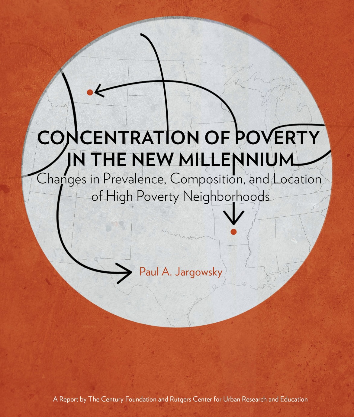
When poverty concentrates this way, its effects compound. As Professor of Public Policy Paul Jargowsky put it in his 2013 report for The Century Foundation, a more concentrated residential pattern means more poor children grow up going to schools that function far below middle-class ones in homes with parents and caregivers with worse access to jobs and worse health outcomes and in communities with stagnant or falling property values, disadvantages that can persist across generations.
Jargowsky documented a troubling resurgence: after declining through the booming 1990s, concentrated poverty surged again after 2000, eventually eclipsing its previous 1990 peak. The maps below, built from the latest American Community Survey five-year estimates, update that picture group by group. What emerges is that the broad geography Jargowsky described is still with us and that the sharpest line running through it is still race, as evidenced in the maps that follow.
A note on comparing the two studies: Jargowsky defined high-poverty neighborhoods using a 40% poverty threshold; the maps here use the more inclusive 25% (HUD) threshold. That means the exact percentages are not directly comparable between the two, but the patterns, the rankings of states, and the contrasts between groups are. Where this new analysis compares the two, it compares geography and rank order, not raw levels.
Poverty doesn’t spread evenly. It pools.
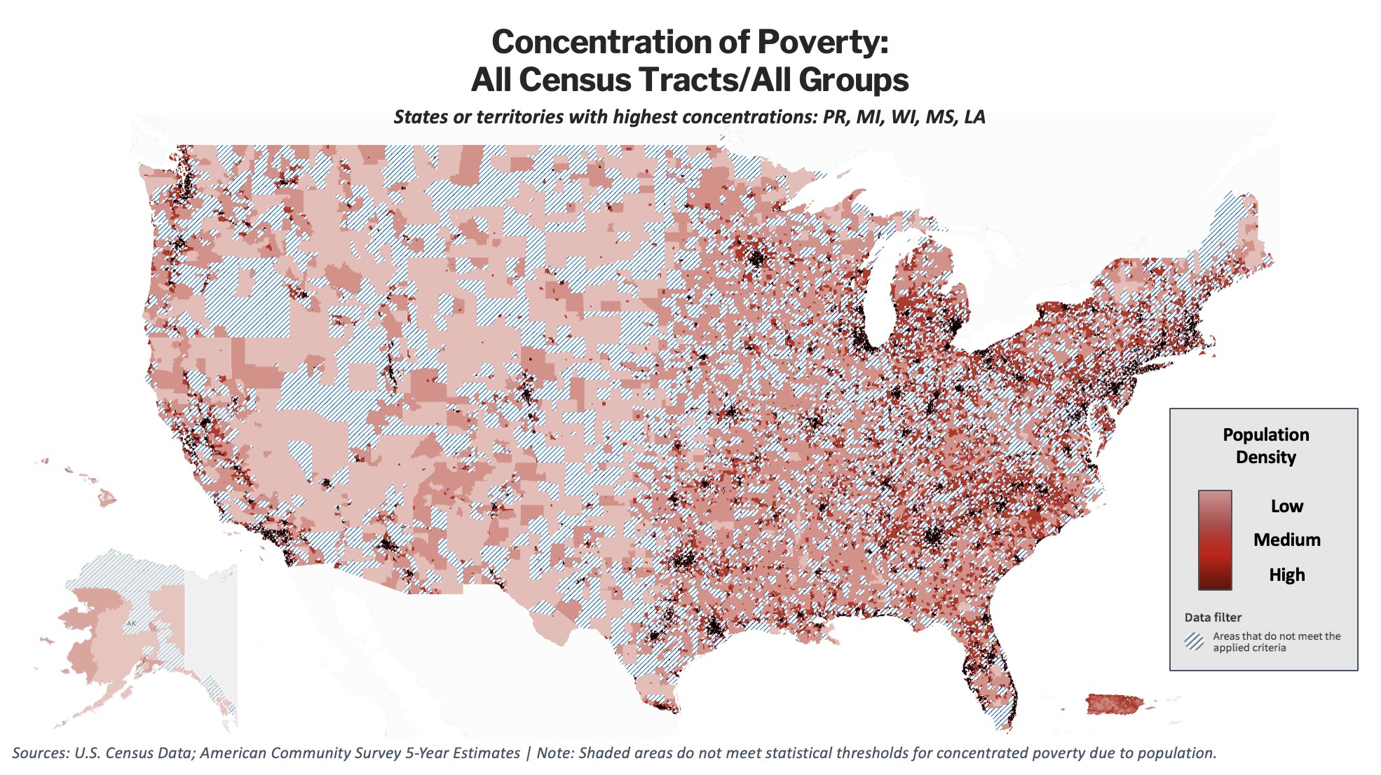
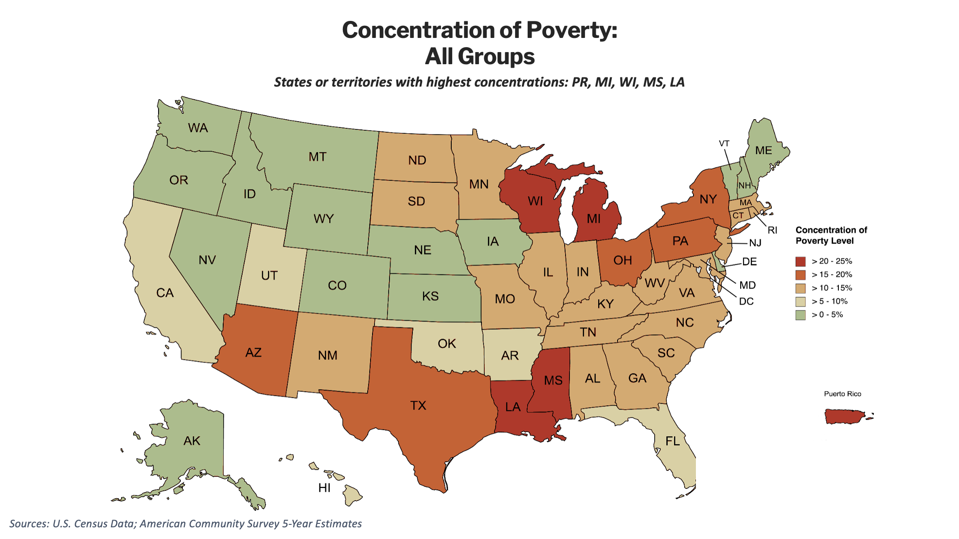
The national map of concentrated poverty is not a smooth gradient. It has hot spots. Across all racial groups combined, concentrations are highest in Puerto Rico, Michigan, Wisconsin, Mississippi, and Louisiana, a set of places that reflects three American geographies at once: the industrial Midwest, the Deep South, and the colonial Caribbean.
This resembles the geography Jargowsky described more than a decade ago. The specific tracts have shifted, and a more inclusive threshold lights up more of the map, but the nexus of the problem has not relocated. The first thing the new maps tells us is therefore a statement about continuity: the places where American poverty persists today are, to a striking degree, the same places it persisted a decade ago.
Concentration is not a simple function of how many people are poor. It is a function of segregation and place, meaning which communities have been historically confined to which neighborhoods. For example, White Americans and Asian Americans have had similar poverty rates for the past several years, both ranging from 9% to 10%. But the two groups experience concentrated poverty in a different number of states, two states for the former and five for the latter, and in very different regions. In other words, two groups can be equally poor and live in entirely different Americas.
The map above is fine-tuned to individual census tracts to show where concentrated poverty reaches its highest levels and the areas where it clusters. But it’s also helpful to look at the broader picture. Below is another view of the data above zoomed out to the state level. The subsequent maps follow this approach for ease of viewing.
There is no single map of concentrated poverty. There are several, each drawn by a different history.
Going beyond Jargowsky’s original maps, the new data adds a clearer view of groups his report did not break out separately. Each turns out to have its own distinct geography. Laid over one another, these are not one map but five, each depicting a different chapter of American history: removal and reservation policy, war and conquest, enslavement and the Great Migration, waves of immigration and the limits placed on it, and a long-subsidized freedom of movement achieved through public policy for one group. Concentrated poverty is not a single phenomenon. It is the visible imprint of where this country’s institutions have, over generations, allowed or even encouraged different individuals and communities to live.
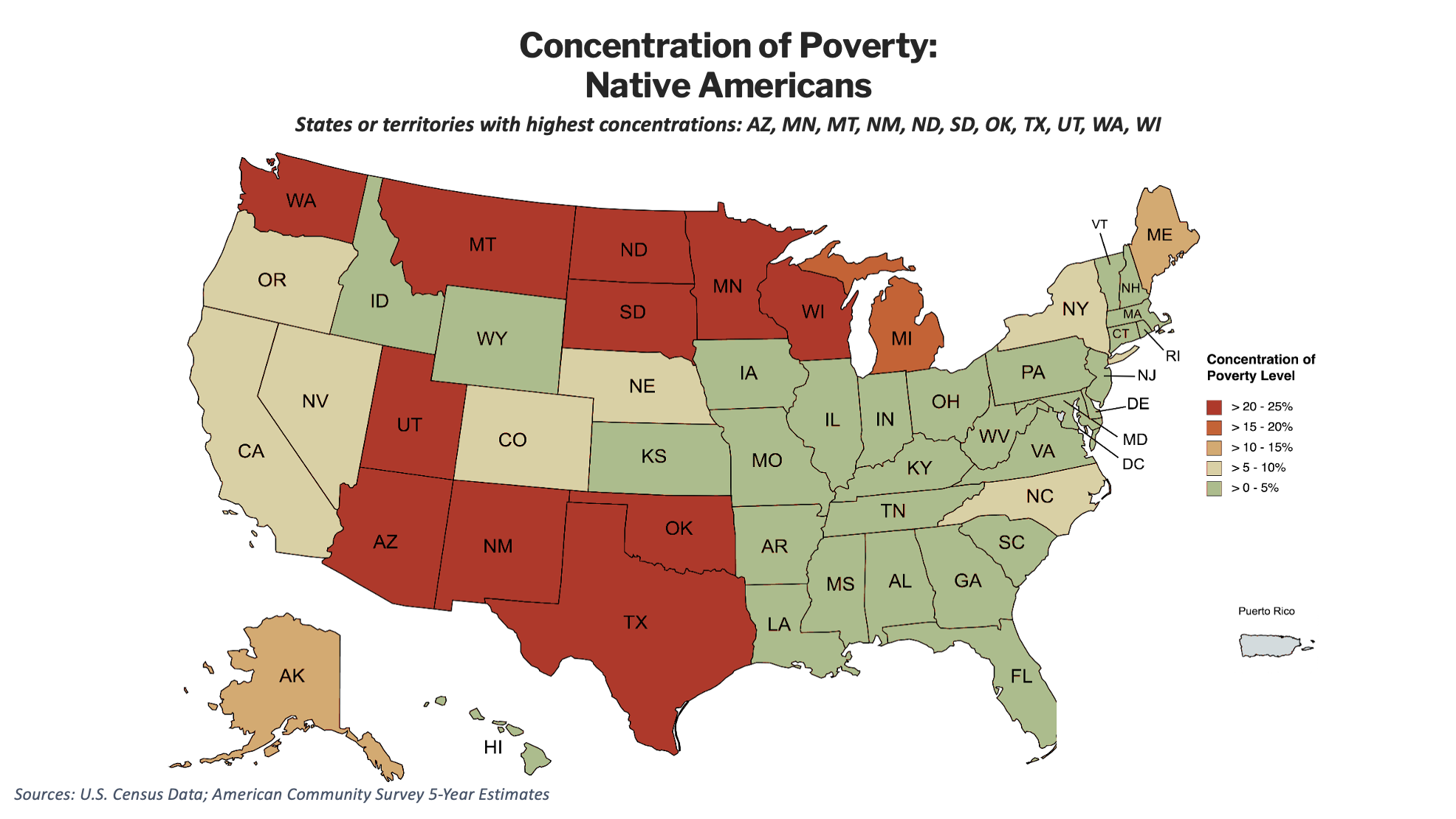
Native American concentrated poverty maps almost perfectly onto the country’s reservation lands and tribal regions: Arizona, New Mexico, and the Mountain West; the Dakotas, Montana, and Minnesota across the northern Plains; Oklahoma; and the Upper Midwest. It is the most rural of the patterns, and it sits where federal removal and reservation policy placed Native communities more than a century ago. Today, the U.S. government officially recognizes 574 Tribal Nations across the country, which establishes a formal government-to-government relationship and affirms their sovereign powers. At the state level, there are roughly 60 to 75 state-recognized tribes, though this count fluctuates and is determined by individual state governments rather than the federal government.
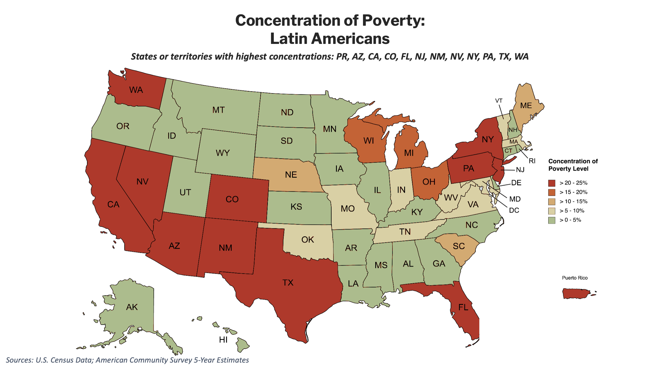
Latin American/Hispanic concentrated poverty is the most geographically widespread of all, reaching high concentration across the Southwest and West, parts of the Northeast, Florida, and Puerto Rico — eleven states plus the territory. Much of that footprint predates the population it describes. When the Treaty of Guadalupe Hidalgo ended the Mexican-American War in 1848, the United States absorbed roughly half of Mexico’s territory: present-day California, Nevada, and Utah, and much of Arizona, New Mexico, and Colorado. The Mexican families already living there became Americans in place and name if not always in culture or protections, the border having crossed them. Later waves of agricultural and industrial labor migration, the U.S. annexation of Puerto Rico in 1898, and the citizenship later extended to its residents, and arrivals from across Latin America after 1965 further extended Latin American communities from the Southwest into Florida and the industrial Northeast.
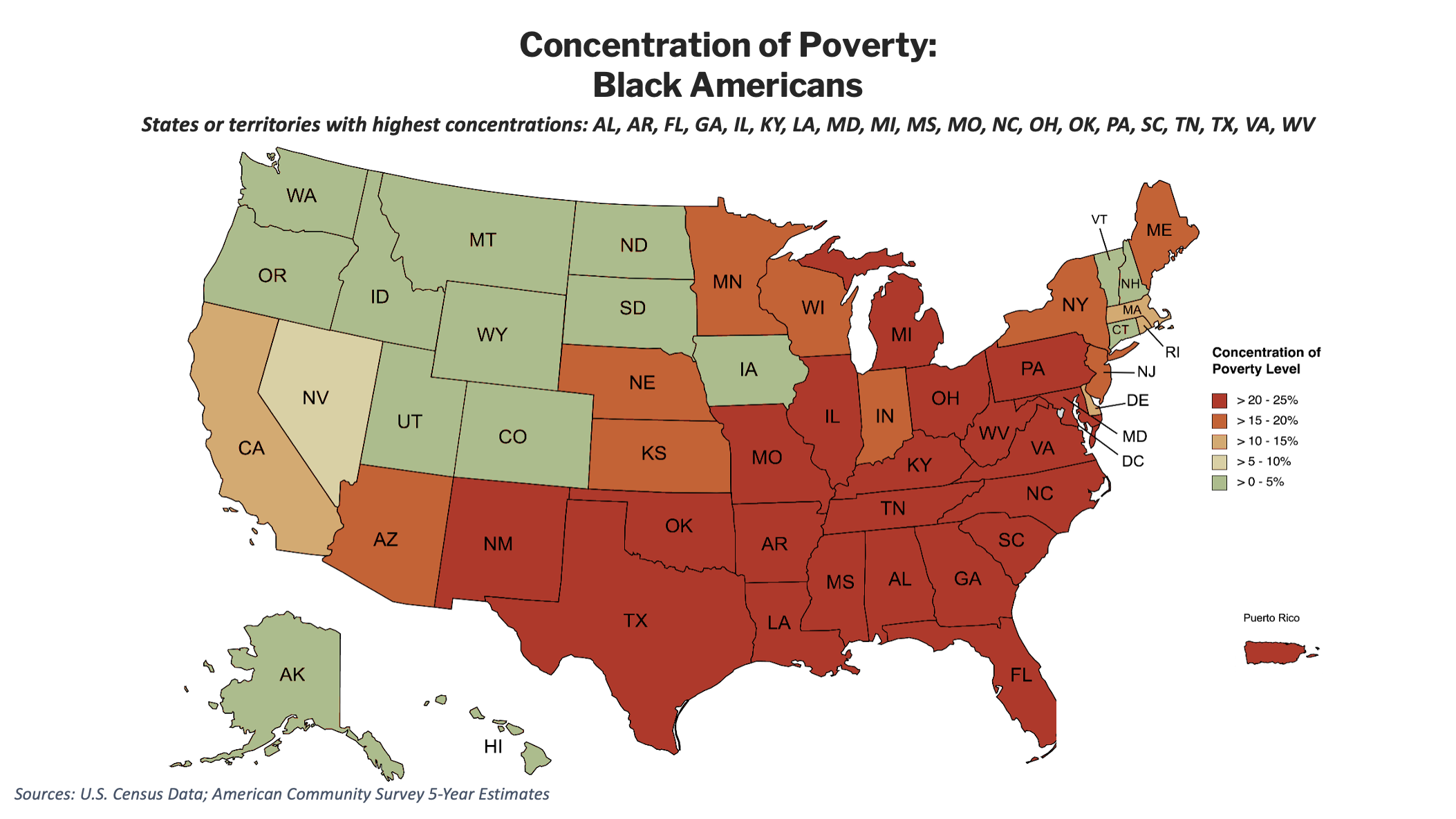
Black American concentrated poverty is the most severe and the most sharply drawn of all, and its geography records two chapters of history at once. Black Americans descend largely from West and Central Africans brought to North America in bondage from the early 1600s and enslaved overwhelmingly on Southern plantations, which is why concentrated poverty still traces the old plantation belt of the Deep South. Then, during the Great Migration of roughly 1910 to 1970, over six million Black Americans left the rural South for the industrial cities of the North and Midwest, where racial zoning, restrictive covenants, and federal redlining confined them to segregated, disinvested neighborhoods, the same pattern the map still shows today.
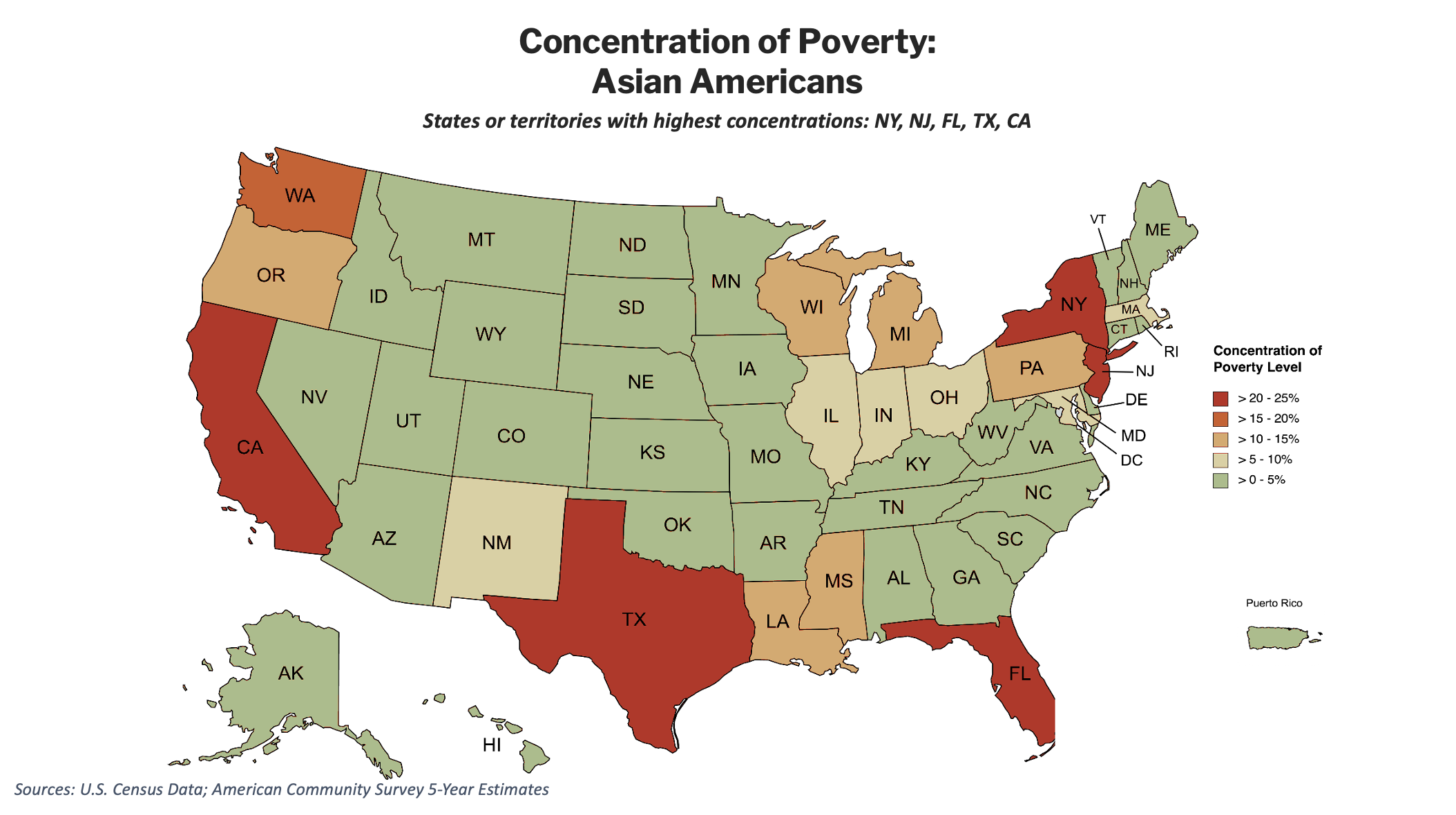
Asian American concentrated poverty, by contrast, clusters in the major immigrant-gateway and coastal-metro states: California, New York, New Jersey, Texas, and Florida. It is largely a metropolitan pattern, shaped by where both historic and recent immigration has happened, and reflects U.S. labor history as much as anything else. For example, major Chinese settlement in California began in the 1840s but was halted by the Chinese Exclusion Act of 1882. By comparison, Florida saw a small early wave of immigration in the 1880s but far more growth in its Asian populations after the Immigration and Nationality Act of 1965, a pattern largely mirrored in other states along the Eastern seaboard.
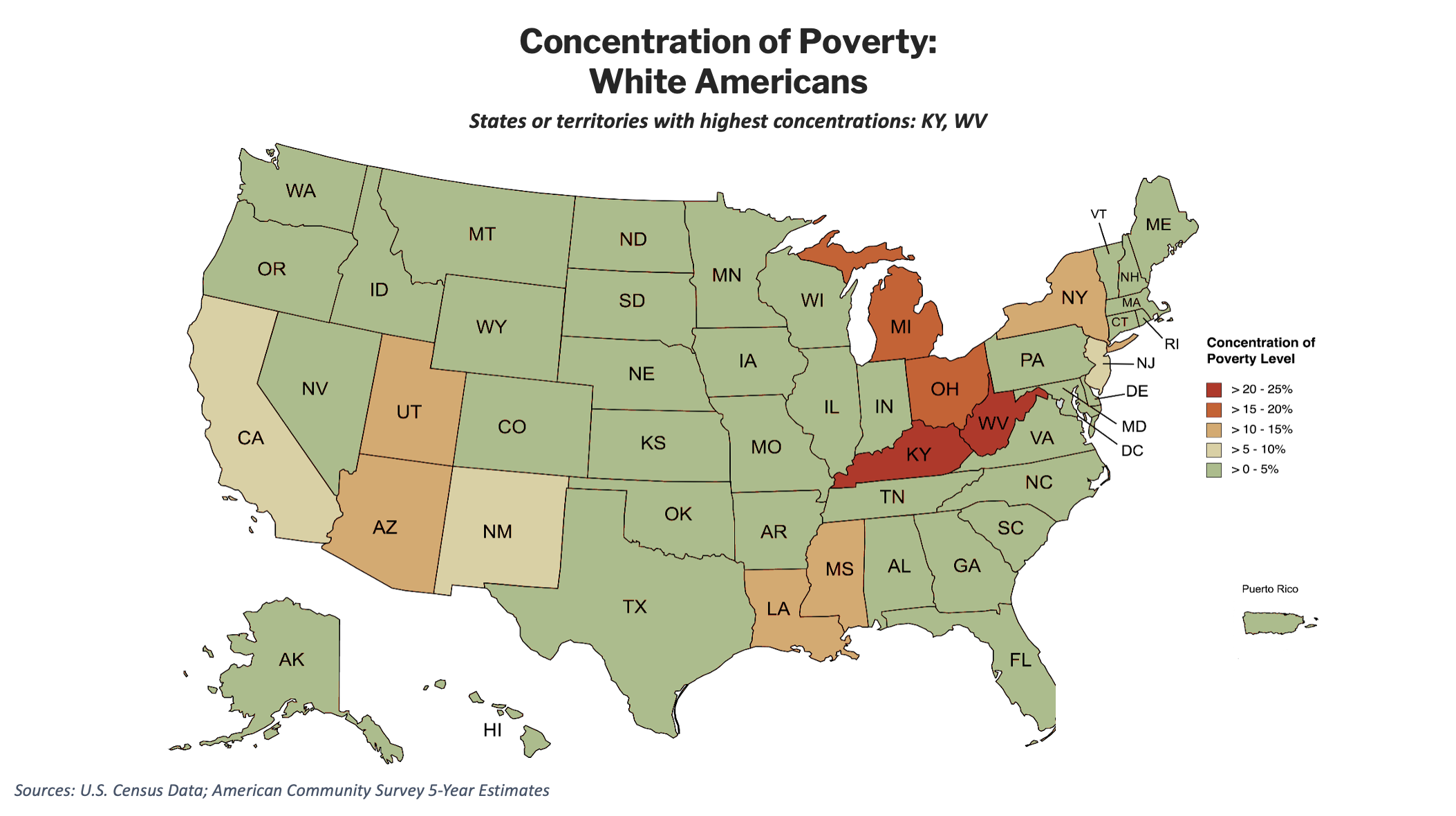
White American concentrated poverty is the near-inverse of the others. Across almost the entire country it sits at the lowest concentration. Two exceptions, Kentucky and West Virginia, fall in the Appalachian coalfields, a story of regional economic decline rather than racial segregation. Alone among these groups, White Americans and their European ancestors faced few if any legal restrictions based on their race or ethnicity on where they could live or buy land and were often actively encouraged to spread out. The Homestead Acts transferred hundreds of millions of acres of largely expropriated land overwhelmingly to European immigrants and their descendants, and 20th-century public policy, such as federally backed mortgages and the GI Bill, underwrote White American families’ movement into suburbs nationwide. Present in virtually every region across the country, White American poverty tends to be diffuse rather than pooled.
For Black Americans, poverty is overwhelmingly a concentrated experience. For White Americans, it is not. These findings have not changed.
If you put the two maps next to each other, the asymmetry is impossible to miss.
On the White-alone map, almost the entire country sits in the lowest bands. Concentrated White poverty reaches the top tier in only two states — Kentucky and West Virginia — with Michigan and Ohio close behind. For most White Americans, even those who are poor, poverty is not a neighborhood condition.
On the Black-alone map, much of the country turns red. Black poverty reaches the highest concentration band in roughly twenty states, a near-continuous expanse covering nearly the entire South, sweeping up through the industrial Midwest and reaching into the Mid-Atlantic: Alabama, Arkansas, Florida, Georgia, Illinois, Kentucky, Louisiana, Maryland, Michigan, Mississippi, Missouri, North Carolina, Ohio, Oklahoma, Pennsylvania, South Carolina, Tennessee, Texas, Virginia, and West Virginia.
Two states versus twenty. This gap stands out most in this dataset and is precisely what Jargowsky flagged in 2013 when he wrote that White and Black poverty are “fundamentally different when neighborhood context is taken into account.” In his data, White concentration topped out at 11.4% in any state, while Black concentration reached 41.8% in Michigan with a “large and populous swath” running from the rust belt down the Mississippi River. The maps here, built on newer data and a more inclusive threshold, show the same swath and the same fundamental divide.
There is an important subtlety here. Jargowsky also found that high-poverty neighborhoods were slowly diversifying: the White population of such neighborhoods more than doubled between 2000 and 2011, and the Black share of their residents edged down. Both things can be true at once. Who lives in high-poverty neighborhoods has grown somewhat more mixed, but the odds that a poor person of a given race lives in one remain wildly unequal. The composition softened. The concentration gap did not. More than a decade on, that is still the defining feature of the map.
What’s changed and what hasn’t
A decade after Jargowsky’s warning, the headline is continuity rather than change.
What hasn’t changed is the core of his finding: concentrated poverty is still anchored in the same Midwest-to-Mississippi, Deep South corridor, and it still falls along stark racial lines. The likelihood that a poor Black American lives in a high-poverty neighborhood remains in a different statistical universe from the likelihood for a poor White American. Neighborhood-level segregation, not the simple prevalence of poverty, continues to be the engine.
What the new data adds is resolution. We can now see the separate geographies of Native American, Asian American, and Latin American concentrated poverty that earlier state maps blurred together, a reminder that “concentrated poverty” describes several distinct American experiences, not one.
The reason any of this matters is the reason Jargowsky gave at the outset, place compounds poverty. A poor young person in a scattered-poverty neighborhood and a poor young person in a high-poverty one could have the same family income but very different odds: different access to schools, nutritious food, parks and greenspaces, healthcare facilities, transportation, the job market, and the list goes on. As long as the map looks like this, any anti-poverty policy that ignores geography will keep treating the symptom and missing the structure.
Definitions & Notes
- Concentration of poverty is the share of a group’s poor population living in high-poverty census tracts, tabulated by the author from tract-level Census data.
- High-poverty tract: A census tract with a poverty rate of 25% or more — the HUD Qualified Census Tract threshold, and a more inclusive cutoff than the 40% threshold used in Jargowsky (2013).
- Island areas: The maps include Puerto Rico but omit Guam, the Northern Mariana Islands, American Samoa, and the U.S. Virgin Islands. The American Community Survey does not cover these areas fully or consistently enough to produce reliable group-level concentration estimates, so they are left off the maps rather than shown with incomplete data.
- Comparison caveat: Because the threshold differs, percentages are not directly comparable between this analysis and Jargowsky’s. Comparisons in this post are of geographic pattern and state rank order, not raw levels.
- National poverty trends: Official poverty rates and counts are from the U.S. Census Bureau’s Poverty in the United States: 2024 (P60-287) and the Census historical poverty tables (1959–2024); the 1964 figure of 36.1 million is from the HHS/ASPE report Poverty in the United States: 50-Year Trends and Safety Net Impacts (2016); elderly poverty and Social Security figures are from Census and Pew Research Center analyses. The 2024 poverty thresholds (about $16,320 for a single adult under 65; a weighted-average $32,130 for a family of four) are from the Census Bureau and the Congressional Research Service.
- U.S. Census terminology and categories: The terms used in this research generally follow those used in the U.S. Census for consistency and ease of reference to that dataset. It goes without saying that these terms do not always reflect the same terms that individuals or groups may use outside of filling out a U.S. Census form.
Sources
- Paul A. Jargowsky, Concentration of Poverty in the New Millennium (The Century Foundation and Rutgers CURE, 2013).
- U.S. Census Bureau, American Community Survey five-year estimates (2023 release). Race and ethnicity categories use the Census “alone” definitions.
Acknowledgements
I’m grateful to the team at the Racial Equity Institute for introducing me to the work of Professor Paul Jargowsky (and to him for his excellent scholarship) and for the encouragement and support to produce this updated research.